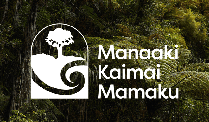
To kick start 2025, we introduce you to our refreshed visual identity! Our bold new look honours the original toi that was gifted to us, of which all elements hold mana and meaning.
The elements
🌳 Kauri — The rakau rangatira stands tall with all taonga under its canopy. In our logo, it represents tangata whenua as tīpuna and kaitiaki.
💧Koru — Ko te wai te ora o ngā mea katoa | Water is the life-giver of all things. The two intertwining koru are the flowing waters of the whenua and the moana. This represents kotahitanga — all people and communities coming together to restore the mauri of the Kaimai Mamaku.
⚪ The curved top of our logo is part of a circle, representing te ao Māori, where everything is connected in a holistic sense.
⛰The Kaimai ridgeline represents our landscape-scale restoration project - “Mai uta ki Tai” | From Mountains to Sea.


